25-TENNIS
Semi-Pro
What do you think was the worst outfit Federer has ever worn?
My pick: Roland Garros 2019
My pick: Roland Garros 2019
That outfit is good what are you taking aboutAO 2018. I don't think it's possible to get worse than this.

To each our own, I suppose ¯\_(ツ)_/¯That outfit is good what are you taking about

What do you think was the worst outfit Federer has ever worn?
My pick: Roland Garros 2019
AO 2018. I don't think it's possible to get worse than this.
I mean what the hell is this?
AO 2018. I don't think it's possible to get worse than this.
I like AO2018, however I cannot like 2015 USO. Absolute epitome of Nike’s pink craze, I compare AO 2018 as a French neopolitan, while 2015 USO being a neopolitan somebody accidentally dropped while giving it to the corner store. However to each their own.I’m literally here just thinking that each one of these outfits is really good
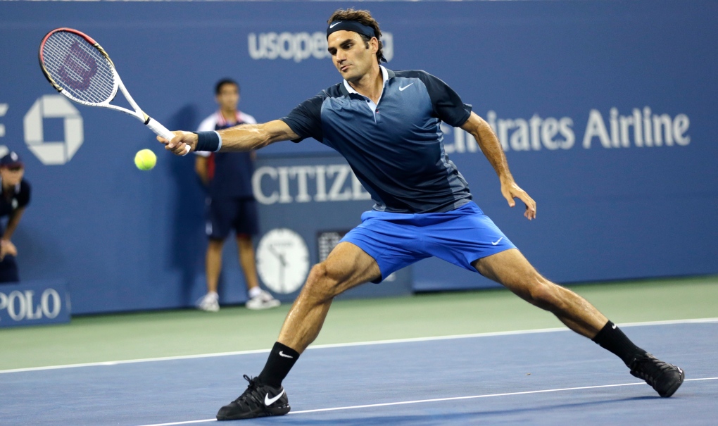
Awesome outfit. It just looks a little bit like Fed got off the set of Castaway, he needed a shave lolIW 2018 was similar but did everything much better

This was much better. Still not my favorite Nike RF era, but I didn't find it offensively bad like the AO one.IW 2018 was similar but did everything much better
If Nike had released this with black or grey shorts instead of blue it would've been GOAT material.this takes the cake for me
Awesome outfit. It just looks a little bit like Fed got off the set of Castaway, he needed a shave lol
yeah, this is pretty bad.
Personally, I loved it. Instead of at night going all black, he went all white. I loved it and the sneakers. Again, I think UNIQLO is the worst and every outfit has blown. Nike may have had some misses, but UNIQLO takes the cake.I mean what the hell is this?loved this
Lol, I loved that one too. I thought US open 2013 was not great, AO 2011 and AO 2015.Roland Garros 2015 purple and pink. It's a complete nightmare
this takes the cake for me
Yeah I’m part of the Uniqlo is doing well side. But yeah the shirt and shoe combo is wonderful. Particularly that shirt, but my god who decided it’d be best for him to wear blue shorts. Really ruined a potential great outfit.I'm the last person to ask on the color aspect. I have a version of color blindness where I can't see the full palette of colors that others can see. So, I can tell the difference between blue, red, green, etc... but I miss the subtleties of the shades within those groups. That said, what it looks like to me with this outfit is that the shorts are a mismatch with the colors in the shirt. If the shorts matched the same color as the sleeves or if they were white with darker blue highlights, I feel like that outfit would be awesome.
Anyway, to each his own as far as what is great and what is horrible. I like some of the outfits that others have said are terrible in this thread. I was a big fan of the RF gear when he was at Nike and thought he had some pretty epic kits. I don't care for what he is wearing now as it's pretty boring in my opinion. But I can see how others would view the Uniqlo as simple and classic as well. Just not my thing...
It works pretty well with his backhand in here,AO 2018. I don't think it's possible to get worse than this.


It looks like it was made out of 3 different sets.
which was the style at the timeMost of his outfits from 00s were horrible and way too oversized (at least not as big as Murray's FP or Roddick's Lacoste stuff though). Ignoring the fit:
It looks like it was made out of 3 different sets.

this takes the cake for me
He's had some boring ones and ones I didn't like over the years, but these are the ones that make me cringe:
UPS Fed (2008 US Open)- Luckily he only played a round or 2 in it then switched to the red shirt that looked a lot better
Barney Fed (2015 French Open/Halle)- I like purple, I like pink, I don't like them together
Hello Kitty Fed (US Open 2015)- Too much white and pink together with no accents to break it up. A real shame because his teal day outfit looked fantastic
Madrid 2019- The shade of light teal looked drab and washed out with not enough contrast against white shorts then you get hit with some weird black shoes
French Open 2019- Weird shade of brown and both outfits just looked awful with his shoes, especially the brown and orange one. Brown also didn't look good against the red clay nor Nadal who was looking sick.
Normally, I'd post pics, but not in this case..
Especially because the supposed right handed topspin backhand 'swing path' design was an insult to left handers, although it was unintentionally kinda part of the swing path for a left handed slice backhand - or LH topspin FH as well lol!AO 2018. I don't think it's possible to get worse than this.
I’m really getting in touch with my “not liking the pro staff 97 2014” side, thing looks ugly as sin.Meh, neon green
 I really liked that outfit; bought the jacket - which I still wear - shoes and cap; always regretted not buying the shirt and shorts too lol! What don't you like about it, too UPS?
Yup. That's exactly what I thought of.
That one gets my vote, too
This is also not one of my favorites...
/s tag
(Seinfeld voice) "Aww the 'sarcasm switch' - I was on the iPhone; I didn't see the 'sarcasm switch' at the bottom!"he was being sarcastic
Phew, crisis averted! Things could be worse.../s tag
It's one of my favorite Nike kits of all time, for any player.
Hahahahahaha Barney Fed! DeadHe's had some boring ones and ones I didn't like over the years, but these are the ones that make me cringe:
UPS Fed (2008 US Open)- Luckily he only played a round or 2 in it then switched to the red shirt that looked a lot better
Barney Fed (2015 French Open/Halle)- I like purple, I like pink, I don't like them together
Hello Kitty Fed (US Open 2015)- Too much white and pink together with no accents to break it up. A real shame because his teal day outfit looked fantastic
Madrid 2019- The shade of light teal looked drab and washed out with not enough contrast against white shorts then you get hit with some weird black shoes
French Open 2019- Weird shade of brown and both outfits just looked awful with his shoes, especially the brown and orange one. Brown also didn't look good against the red clay nor Nadal who was looking sick.
Normally, I'd post pics, but not in this case..


