You are using an out of date browser. It may not display this or other websites correctly.
You should upgrade or use an alternative browser.
You should upgrade or use an alternative browser.
Better Logo Federer's or Nadal's
- Thread starter bjorn23
- Start date
viduka0101
Hall of Fame
Federer has a better logo but I wouldn't want any of their logos on my shirt or pants or whatever
also Nadal's looks like one of those stupid celtic tattoos
also Nadal's looks like one of those stupid celtic tattoos
Nadalfan89
Hall of Fame
They're both pretty bad, but I'd say Federer's is better.
mtommer
Hall of Fame
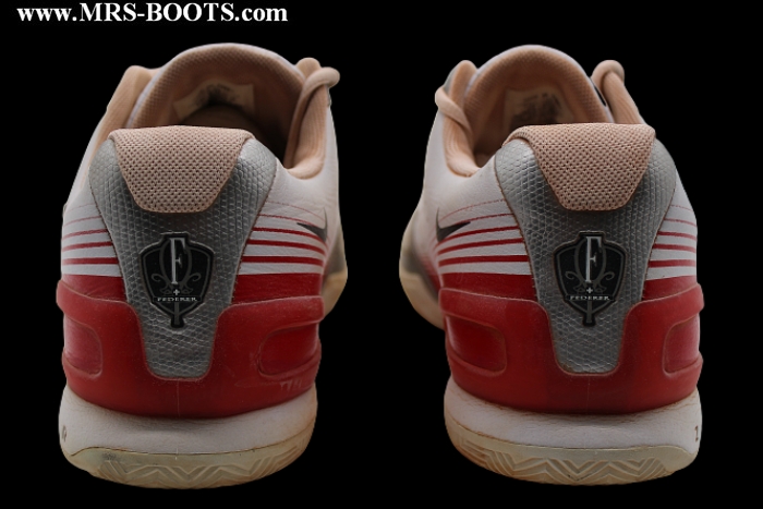
I'd say Fed's. His logo is a perfect example of great logo design. It's distinctive, instantly recognizable, communicates exactly what's intended, and it's styling is classically aligned rather than ostentatious which often quickly fades as a fad.
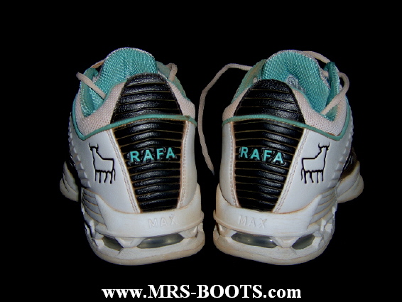
Rafa's bull logo is a good logo but only if one knows Rafa. Just by looking at the logo, for one who doesn't know Rafa, it's hard to "capture" what the logo is trying to say. I guess the best way I can explain the difference is that Nike created a brand with Roger's logo but only created fans with Rafa's.
Rafa's bull logo is a good logo but only if one knows Rafa. Just by looking at the logo, for one who doesn't know Rafa, it's hard to "capture" what the logo is trying to say. I guess the best way I can explain the difference is that Nike created a brand with Roger's logo but only created fans with Rafa's.
niff
Legend
Indeed =/ I've only just realised that is his logo, after seeing this thread. So.... Roger'sNadal has a logo?

Manus Domini
Hall of Fame
I dunno I've never been into stylistic lettering; letters are letters. The bull is better imagery and representation, but I really think the design could have been much better. I still have to go for the bull, i'm not into wearing someone else's initials.
what if your initials were Robert Fernandez, huh? lol
I say Fed's just because I don't like the way they designed the bull (even though it's the sign of my patron saint)
Dreamer
Professional
what if your initials were Robert Fernandez, huh? lol
I say Fed's just because I don't like the way they designed the bull (even though it's the sign of my patron saint)
Haha you clever boy. Then wear it I shall!
and about the bull, it's a little skinny right? reminds me of some energy drink or something. Not red bull maybe a green monster energy drink
jackson vile
G.O.A.T.
The reason I like Nadal's logo is because it is much more manly. It says "I'm here to kick @$$ and take names".
Roger's logo is good for off court wear, ie just casual wear. To me Roger's logo says "I am here to look cool first win second".
Roger's logo is good for off court wear, ie just casual wear. To me Roger's logo says "I am here to look cool first win second".
T
TennisandMusic
Guest
Nadal's by leaps and bounds. It's an actual image with a modern design that has meaning beyond being self absorbed. Monogrammed initials are corny as heck.
W
Winky
Guest
Didn't know Nadal had a logo.
Gotta get me one.
WınkyʎʞuıW
or maybe W͔̫͎̣̫̣̓̆͠ī̢̜͖̭̲͉͇̳͊̈́n̬͙̟̖̗̩͍͊̑ḵ͇̜̳̥̰̾ͤ͂̈͗ͦͩy̱ͬͬ
Gotta get me one.
WınkyʎʞuıW
or maybe W͔̫͎̣̫̣̓̆͠ī̢̜͖̭̲͉͇̳͊̈́n̬͙̟̖̗̩͍͊̑ḵ͇̜̳̥̰̾ͤ͂̈͗ͦͩy̱ͬͬ
jack_kramer
Banned
RaFa now has two logos:


Semi-Pro
Hall of Fame
RaFa now has two logos:
I thought a saw this on some of his stuff, wasn't sure if it was his logo or not. Is it supposed to resemble like bull horns or something?
Omega_7000
Legend
The reason I like Nadal's logo is because it is much more manly.
It's manly alright...It looks like a pen*s with balls hanging on the side!
flyinghippos101
Legend
I think both are kinda uninspiring TBH. Fed's use of his initials are tacky and Nadal's bull logo seems as mentioned above, underwhelming. Then again, the more aesthetically pleasing logo is Rog's.
Last edited:
TheTruth
G.O.A.T.
I go with Rafa's. I don't like the idea of initials, to me that's seems like too much self-absorbtion for others to walk around bearing your name. I'd go with the bull because it signifies strength and qualities that anyone can acquire as opposed to saying I want to be like Rafa. I feel the same way about Calvin Klein, and other designers. No free marketing here. The only name I'll ever wear will be my own.
mandy01
G.O.A.T.
I LOLedNadal is not lucky to have a logo, the logo is lucky to have Nadal.
Pags you're almost back to your best,mate .
Vamos
jamesblakefan#1
G.O.A.T.
Nadal's by leaps and bounds. It's an actual image with a modern design that has meaning beyond being self absorbed. Monogrammed initials are corny as heck.
Shocking....
P_Agony
Banned
I LOLed
Pags you're almost back to your best,mate .
Vamos
I try to keep a good form. Not always easy

TJfederer16
Hall of Fame
Fed's by a mile its a masterpiece fantastic design from nike and very clever, not too keen on Rafa's but its ok.
YodaKnowsBest
Banned
Nadal is not lucky to have a logo, the logo is lucky to have Nadal.
Nice one. :lol:
veroniquem
Bionic Poster
Agree. What's creative about initials?Nadal's by leaps and bounds. It's an actual image with a modern design that has meaning beyond being self absorbed. Monogrammed initials are corny as heck.
flyinghippos101
Legend
Nike owns Federer and Nadal. Period.
fed_the_savior
Banned
I'm torn. But I'd never even seen Nadal's before, so if he doesn't use it enough it doesn't count.
Federer has a nicer, more distinct mark. It's very classic and understated and it works well. I think it fits him very well.
Nadal's is nice aesthetically, but is a little vague in connection to him. I do like the energetic lines, fitting for Nadal's powerful style of play. I think maybe it needs to grow and establish itself.
Nadal's is nice aesthetically, but is a little vague in connection to him. I do like the energetic lines, fitting for Nadal's powerful style of play. I think maybe it needs to grow and establish itself.
Bud
Bionic Poster
Federer has a nicer, more distinct mark. It's very classic and understated and it works well. I think it fits him very well.
Nadal's is nice aesthetically, but is a little vague in connection to him. I do like the energetic lines, fitting for Nadal's powerful style of play. I think maybe it needs to grow and establish itself.
No, it belongs on a set of bath towels :lol:

forzamilan90
Legend
federer's by a mile, this ain't even close
Tennis_Monk
Hall of Fame
Looks like most people didnt realize. actually the logos are switched.
what you see as Nadal's bulls logo is actually Roger's and vice versa. The initials are not RF but RP (Rafael Perera) made to look like RF. The bull isnt actually a bull but its federer pose when he strikes a forehand, made to look like bull.
The reasons
1) mutual respect (and such other crap)
2) Roger is a ******* and Nadal is a *******.
3) whats the point in putting a logo on one's own shirt that is hard to see. have an opponent wear them and you have a sense of pride.
4)..... well, if you still believe me, let me know. i will post more.
Tennis_Monk
Hall of Fame
Roger is not a *******
you think so?
Raiden
Hall of Fame
Nadal's universal name is sickles?Also Roger's logo is a bit self absorbed where as Rafa's logo represents a universal name given to him by fans.
TheOneHander
Professional
Delete post.
Last edited:
kickenchiken92
New User

This is Roger's, no?
niff
Legend
Omg, hilariously I have just seen something similar on rf.com :lol: crazy crazy people.rafa! cause you can do this!!
http://i51.tinypic.com/1sm91t.jpg

M
meg0529
Guest
^ that's not a legit tattoo, it's drawn using a pen. lol.
I still can't accept Rafas logo! This is what I see when I'm watching his logo
http://www.theappsplanet.com/wp-content/uploads/2010/09/Quake-3-arena.jpg
http://www.theappsplanet.com/wp-content/uploads/2010/09/Quake-3-arena.jpg
Similar threads
- Replies
- 200
- Views
- 24K
- Replies
- 17
- Views
- 6K
- Poll
- Replies
- 20
- Views
- 4K
- Replies
- 45
- Views
- 4K