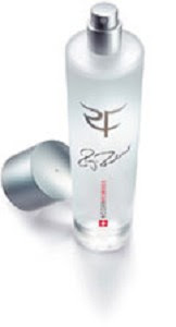
I thought I had read she came up with the initial concept for an RF cologne, and that is indeed true.
NY Times 2009
The idea for a monogram emerged from the logo that Mirka Vavrinec, now Federer’s wife, and her father developed for his fragrance,
RF-Roger Federer, introduced in 2003. The result was a freehand squiggle. If you knew what you were looking at, you saw the R and the F; if you didn’t, you didn’t. (A three-letter monogram was apparently never an option because Federer has no middle name.)
Federer liked the approach and suggested that Nike come up with a strategy along the same lines.
“For me, it’s important that a fan can buy something that is related to me,” he said. “Like in soccer, you buy a shirt and it’s got somebody’s name on the back. That’s kind of a cool thing.”
His intent was that a monogram would offer a connection as direct but not as literal as a team jersey.
From their first, Ralph Lauren-like crest, Nike “evolved the concept and made it more relevant to performance products, very modern and very sleek,” said Janet Lucena, the design director for Nike global tennis apparel. Letters are laser-cut instead of embroidered, for a more contemporary look and a lighter weight.
“They’ve eliminated the common element, the vertical stroke, so it’s only the horizontals that differentiate the two letters,” said Michael Bierut, a partner in the New York office of
Pentagram, the international design consulting firm. “I think it’s a nice balancing act — the idea of tradition with this serif font and modernity with the missing parts of the letters, asking your mind’s eye to fill in what’s not there.”
The Federer monogram, Bierut said, “is not particularly remarkable as a logo, but within its genre and the overall landscape of sports graphics, I think it’s quite distinctive.”
“The ‘NY’ for the Yankees — that’s a monogram, too,” he continued. “But sports monograms are generally more forthright and blunt. The Federer monogram creates not a sports brand but a fashion brand.”
The font — a slightly redrawn version of Bodoni, which with its cousin Didot has been the basis for logos for Vogue, Giorgio Armani and Louis Vuitton — is “a signifier of fashion at the high end,” Bierut said, adding, “With the sort of enigmatic way it’s been drawn, Federer’s monogram is partaking of the cues of high design.”
Of the monogrammed items Nike has developed for Federer, the cap and the warm-up jacket are for sale. Despite an appeal that may seem limited at retail (attention, Ralph Fiennes: your monogram is waiting), the response has been strong, said a Nike spokeswoman who declined to divulge sales figures. Unlike athletes’ product lines branded with a symbol — René Lacoste’s trademark crocodile or Greg Norman’s shark — Federer’s monogram puts no neutral zone between him and the person wearing it.
“It’s easy for people who have no idea what that alligator means to wear a Lacoste shirt without thinking they’re contributing to the greater glory of another person,” Bierut said. But in Federer’s case, the product is burnishing his image: he is the brand.