BradThomas2121
Rookie
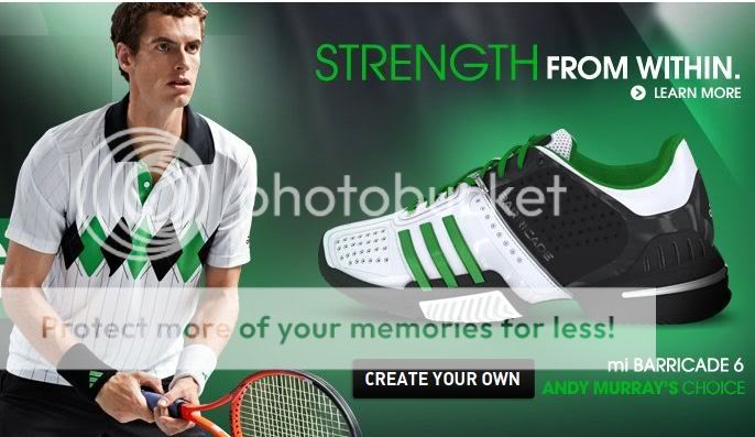
Checked out the miadidas site to look at B6's and if you look murray has the white/green/black shoes and polo in the picture

Truly awful colour scheme and pattern...really, really, baaaad. Whoever designed that needs to be shot.

Hey... lets re-use this old Lendl design. No-one will notice. :roll:

Not similar enough? Don't worry. They launched a Lendl classics range last year too...

Truly awful colour scheme and pattern...really, really, baaaad. Whoever designed that needs to be shot.

Shoes look good though
Truly awful colour scheme and pattern...really, really, baaaad. Whoever designed that needs to be shot.

shoes look ugly with the black ... wish it was a more brighter green.
Andy Murray's black/blue outfit at the WTF last year was the one Fred Perry outfit that i liked on him! It went so well with the court color.
I agree the green could be brighter, though it's not bad as is. I like the black actually. Sets it apart from the white/green BV from last year.
Shoes look good though
I'd buy those shoes for under $100, we need more green from Adidas, and in tennis apparel in general.
Too bad adidas doesn't make em in wide widths... :evil:
Truly awful colour scheme and pattern...really, really, baaaad. Whoever designed that needs to be shot.

It's on the sleeve. And it's a great-looking shirt.Wow when i look at those shoes i think....It could have been SO much better....those shoes are like the movie "Clash Of The Titans" It was a great idea but didn't pull off!
But shirt was a terrible idea and could never of been pulled off, unless it was the 80's or something....Wow I can't even see the Adidas logo? What is this?
Then go buy them. Nothing here is as ugly as some of the garbage they put guys like del Potro and Nadal in...painful. This shirt is classic and stylish. It'll still look good five years from now, where the Nike stuff looks dated 3 days after it comes out. Ugh.that shirt is ugly !!!! I really prefer the nike clothes
Finally! Shorts in the Comp/Barricade line that look like they were actually designed to go with the shirt. I like the look of this stuff; a bit more flair. I suspect adidas didn't have much time to put a line together for Murray when they signed him, so they had to just go simple - this is much better.
Truly awful colour scheme and pattern...really, really, baaaad. Whoever designed that needs to be shot.

I want to see the rest of 2011 Adidas promo pics.
Truly awful colour scheme and pattern...really, really, baaaad. Whoever designed that needs to be shot.
