You are using an out of date browser. It may not display this or other websites correctly.
You should upgrade or use an alternative browser.
You should upgrade or use an alternative browser.
Novak Djokovic new LOGO!
- Thread starter dimeaxe
- Start date

tennis_pro
Bionic Poster
wow it sucks
TheTruth
G.O.A.T.
I like it. it looks artistic...
I do too. It is very artistic. Good job, Nole!
cork_screw
Hall of Fame
That looks really bad. That's worse than beginning graphic design work when I was taking 101 courses and nobody knew what they were doing.
It's trying too hard, it's forced and there are no design principles in it that makes it interesting. He should pay a real graphic designer. It looks like he got a friend to do it.
It's trying too hard, it's forced and there are no design principles in it that makes it interesting. He should pay a real graphic designer. It looks like he got a friend to do it.
Last edited:
DjokovicForTheWin
Banned
Looks better than Nadal's.
flyinghippos101
Legend
I like it. Looks more elegant than Rog's
At least Rafa's logo looks like a bull. This one is...well, if the other posters hadn't pointed it out I wouldn't have noticed the N and the D (Novak's initials) or the number 1.Let's face it. It's crap. It's up there somewhere with Nadal's bullhorns.
Crayola Oblongata
Hall of Fame
Looks like it could be logo for a restaurant, or a bank? Or a news channel!
Nostradamus
Bionic Poster
I think " DJ " would have been much better option
D
Deleted member 21996
Guest
revolting ...
InspectorRacquet
Semi-Pro
The only thing uglier and more pathetic looking is that stupid intertwined "RF" that Nike employs for Fed...
I disagree.
I really like Federer's logo and think Rafa's is pretty darn good, too.
However, every time I look at this logo I always see the D before the N. It's like saying "Djokovic Novak" instead of the correct way. I would like it more if the N showed up more clearly than the D (hence the D barfing joke earlier).
This is coming from a person who doesn't hate any of the top 3, so it's a more rational thought than the "the only thing worse than ___ is ___" fanboy argument.
Fed Kennedy
Legend

Don't like it that much. I'm glad that Novak finally got his logo but this looks way too try-hard-artistic and as others have already pointed out: It looks like the logo for some restaurant or hotel chain. You notice the D before the N (also the N isn't in capital so it's just n). And it really looks like a "D" vomiting. I'm almost sure that I could come up with a better logo if I put enough effort in it, and I'm one of the least creative people that I know.
Djokodal Fan
Hall of Fame
looks much better than womanly RF. I won't complain
D
Deleted member 21996
Guest
^a new wise scholar has joined us...
Deathsticks
Rookie
I like it. Looks more elegant than Rog's
More elegant than Rog's?
Djokovic's new logo is no where near as elegant than Rog's.
The font in Rog's shows way more class than Djoker's (not sure of how to even describe it) logo.
Bobby Jr
G.O.A.T.
It's a pretty uninspiring logo imo. It lacks that snap moment when you see how they worked the elements together in an interesting way. Federer's logo is a great example of a logo having this, as well as nice symmetry and simplicity.
It's also a little predictable once you consider a capital D and how you could take the curve of it and make it look like an N.
It's also a little predictable once you consider a capital D and how you could take the curve of it and make it look like an N.
Larrysümmers
Hall of Fame
i love it, im going to order 3 hats with that logo
Sid_Vicious
G.O.A.T.
I don't think much of it, but if Novak keeps winning the appearance won't matter
I thought Federers logo was really lame at first, but now it is quite popular and recognizable.
I thought Federers logo was really lame at first, but now it is quite popular and recognizable.
M
monfed
Guest
It looks lame imo. Federer's looks more slick and compliments his persona.
Tenez101
Banned
You mean it looks like a Nadal fan?
")
Wow, that was low Senti. Come on, let's try to keep a minimimum standard here.
Lemoned
Rookie
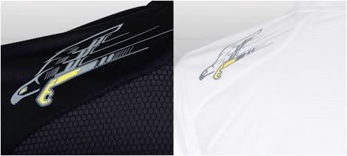
+1 It was a bummer that the line lasted only a season.I miss the falcon.


Tenez101
Banned
Wow, Djokovic's hair looks...normal in this picture. Time to start a thread about it.


jackson vile
G.O.A.T.
here's a better one

It's funny and true!
Djokodal Fan
Hall of Fame
^a new wise scholar has joined us...
Meeh......What do you expect someone to become when surrounded by wise scholars who think something that looks womanly is elegant??
jackson vile
G.O.A.T.
Meeh......What do you expect someone to become when surrounded by wise scholars who think something that looks womanly is elegant??
Look, it's a little fairy
TJfederer16
Hall of Fame
what a failed copy of Roger's RF logo, mixing ND together is just nothing compared to the RF, whats the point in copying can't they think of anything original.
D
Deleted member 21996
Guest
Meeh......What do you expect someone to become when surrounded by wise scholars who think something that looks womanly is elegant??
I expect you to be banned in about a month, like your previous accounts...
vive le beau jeu !
Talk Tennis Guru
i prefered his original "homemade style"...

Evan77
Banned
omg, lol. I forgot about that. it was hilarious. I really like his sense of humori prefered his original "homemade style"...
. that was back in 2006 I think, loland the logo is fine ... it's just a freaking logo, some people will like it some will not. big deal.
netlets
Professional
At least Rafa's logo looks like a bull. This one is...well, if the other posters hadn't pointed it out I wouldn't have noticed the N and the D (Novak's initials) or the number 1.
It also suggests a tennis ball on the bottom. It's funny how people can bash a logo when they don't even understand it. I'm not saying it's beautiful by any means but there are several things happening in just a few graphic elements: the letters N and D, the number 1, and the beginning of a tennis ball. This is not an illustration it is a logo. Where it fails is the overall aesthetic is not very exciting.
netlets
Professional
While these look nice they are conceptually weaker than his new logo. If there was a marriage of the these and his logo then you would have a great logo.
Similar threads
- Replies
- 3
- Views
- 1K
- Replies
- 29
- Views
- 4K
- Replies
- 53
- Views
- 8K
- Replies
- 16
- Views
- 2K