Everyone in tennis melting down while Maestro stays winning

weakera

Talk Tennis Guru
Federer gets RF logo back from Nike

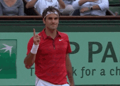
Roger Federer is again the holder of the RF logo that has been associated with his clothing for most of his career.

Federer has not used the logo on his shirts since switching clothing companies two years ago, when he began wearing Uniqlo in an agreement rumored at $30 million annually. The logo was still licensed to his previous apparel company, Nike, whose shoes he still wears even though they have no official sponsorship agreement.

Neither Federer or Uniqlo have indicated whether they plan to use the logo now it has been authorized. The delay was to allow the sale of the rest of Nike's Federer apparel.


giphy.gif
 

Shaolin

G.O.A.T.
Murray’s looks like it was inspired by the WWII SS insignia. :|

Djokovic’s is clearly ripped off from ASICS.

Murray still has the goat logo.

images

Federer's and Murrays are best but that's not saying much.

Rafa's was stolen from the jack links beef jerkey logo. Nole's just looks awful with way too much crammed into it, trying too hard like Nole himself.
 
D

Deleted member 763691

Guest
Nobody in sport or society has ever had a better logo than Rafa.
It literally looks like a really great superhero logo :)
 
D

Deleted member 768841

Guest
Can’t wait for Uniqlo to never sell RF gear in stock for the American market!!!
 
From a design standpoint Rafa's logo is the most unique. It's such a strong silhouette and the two elements of his brand story are integrated into the logo in the most striking and adaptable way. It's instantly recognisable to tennis fans and has no reliance on type. I never found out who designed it - would like to know if it was handled by an agency or if Rafa's internal team developed and refined the concept (anyone know?)

I really like the brand story behind Andy's logo and also Novak Djokovic's insignia but I don't like the finished art for either logo. Andy's insignia concept was tremendously ambitious and would have been very hard to represent iconically, so that was always going to be a challenge. I would have loved if just a small amount of extra time was spent refining the final Novak symbol. The design team that worked on it is obviously very talented. The version of his logo in a combined text and symbol lockup shows that the group designing it has a lot of talent.
 
What's the amazing part of Roger's logo? They used his initials: the easiest and most uninspiring way of a signature.

I always liked the Federer logo but it's definitely the most facile of the 4. It's an insignia logo and it was well handled but nowhere near as adventurous as the other 3 and certainly nothing we hadn't seen before.

I do think the finished art was well handled. Nike was obviously thinking that the execution of the logo was always going to be more important than any concept behind the branding. It's a safe approach and it worked out well for them.

It always reminded me a little bit of the Rocco Forte hotels logo:

1200px-Rocco_Forte_Hotels_logo.svg.png
 
Top