You are using an out of date browser. It may not display this or other websites correctly.
You should upgrade or use an alternative browser.
You should upgrade or use an alternative browser.
Andy Murray's new logo
- Thread starter NatF
- Start date
clayqueen
Talk Tennis Guru
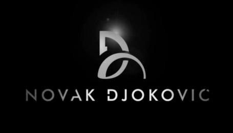
They haven't noticed that Djoko also has his initials as his logo? Djokovic's logo looks like the Oasics logo.
jm1980
Talk Tennis Guru
They haven't noticed that Djoko also has his initials as his logo? Djokovic's logo looks like the Oasics logo.
There's a cool explanation behind Novak's logo:
https://www.youtube.com/watch?v=mVT_4HzM6tQ
PhrygianDominant
Hall of Fame
I think a good logo requires no explanation.
I like Andy's new logo.
I like Andy's new logo.
TennisEnvy
Banned
Doesn't look great to be honest, should be much more clear like RF's.
Rock Strongo
Legend
I like that. A hint of the 80's in it.
I like that. A hint of the 80's in it.
Totally...reminds me of Motley Crue.
I like it!!
Russeljones
Talk Tennis Guru
'Ghastly' doesn't begin to describe it. There is also a hint of SS in it. Ludicrous design.
L
Laurie
Guest
Some people like it, some don't. I don't like it.
Think how much money this agency has been paid to come up with this.
Think how much money this agency has been paid to come up with this.
J
JRAJ1988
Guest
AM design would be much better surely?
Like this..

Like this..
Homeboy Hotel
Hall of Fame
Some people like it, some don't. I don't like it.
Think how much money this agency has been paid to come up with this.
There were 8 different agencies and Murray personally chose this one
AM design would be much better surely?
Like this..
This is so much better.
")
Ughh.. terrible:-|
It's called Asics and it really doesn't. Djokovic's logo is pretty awesome I think.
Of course RF is the GOAT of all logos.
They haven't noticed that Djoko also has his initials as his logo? Djokovic's logo looks like the Oasics logo.
It's called Asics and it really doesn't. Djokovic's logo is pretty awesome I think.
Of course RF is the GOAT of all logos.
Murray's logo is quite a good concept, but it needs too much explanation. A logo should speak for itself.
I have always thought that Federer's logo is very similar to the Rocco Forte Hotel group logo
http://www.seeklogo.com/rf-hotels-logo-118162.html
I have always thought that Federer's logo is very similar to the Rocco Forte Hotel group logo
http://www.seeklogo.com/rf-hotels-logo-118162.html
Last edited:
the green god
Professional
Maybe it's the gothic looking font, but it's a bit Third Reich.
Just what I was about to say.
D
Deleted member 688153
Guest
It's about as good as Novak's logo (would give both 5/10).
Fed's logo is where it's at.
The seal of The Master.
Rafa's is cool too.
Nike know what they're doing.
Fed's logo is where it's at.
The seal of The Master.
Rafa's is cool too.
Nike know what they're doing.
okdude1992
Hall of Fame
Ughh.. terrible:-|
It's called Asics and it really doesn't. Djokovic's logo is pretty awesome I think.
Of course RF is the GOAT of all logos.
As a Graphic Designer, I have to agree. The RF is so visually pleasing. Just simple and elegant. The Djokovic logo is great as well. I never even noticed the 'n' hidden inside the "D" until now. The little hidden meanings make it even better. Rafa's bull logo is cool as well. Kind of rugged and edgy, which is fitting.
The Murray logo is a good concept, but the execution just seems lacking. I'm gunna go comp some new versions of it now
Mainad
Bionic Poster
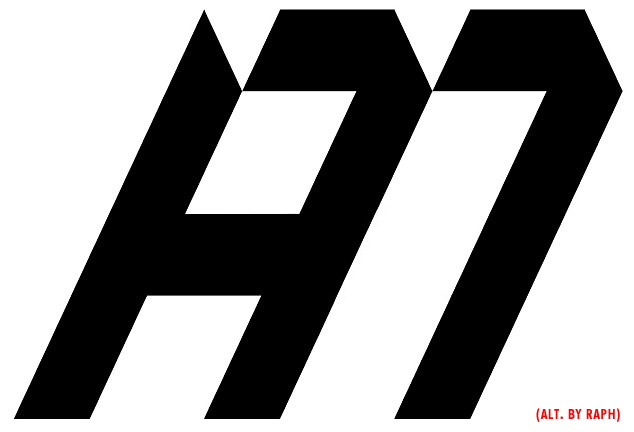
"Andy Murray's new logo incorporates his initials AM and the number 77 - a reference to his Wimbledon title"

Yikes, reminds me of a Swastika! :shock:
Buster Mottram wasn't on the advisory panel by any chance? :wink:
Last edited:
Bobby Jr
G.O.A.T.
The Murray logo is a good concept imo - way better than Djokovic's one. I can see what they've gone for though - something more akin to a mark than just being something based on plainly obvious stylised initials.
It looks like it was inspired by the houndstooth pattern which has Scottish heritage so that was surely deliberate.
Houndstooth fyi.

It looks like it was inspired by the houndstooth pattern which has Scottish heritage so that was surely deliberate.
Houndstooth fyi.
Rhino
Legend
I think it's trying too hard to be clever.
The simplistic look above is preferable. there's nothing amazing about Rogers logo but it's kind of timeless and visually pleasing with it's simplicity and any fool can see what it's saying. the Murray logo needs an explanation (the 77 thing) that most people won't care enough to ask about.
Still its probably all a bit inconsequential anyway, it's not like Murray will be an icon or anything. It's just his personal logo that he obviously likes, good on him.

Timeless, elegant.
And strikes a remarkable resemblance to this,
http://www.seeklogo.com/rf-hotels-logo-118162.html
jm1980
Talk Tennis Guru
Yikes, reminds me of a Swastika! :shock:
Buster Mottram wasn't on the advisory panel by any chance? :wink:
I think it looks more like the SS (Schutzstaffel) logo:

jm1980
Talk Tennis Guru

smoledman
G.O.A.T.
I think it looks more like the SS (Schutzstaffel) logo:
Yeah Andy Murray should have his head examined and especially whoever designed the logo.
andy murray the ****!
raphMODE
Professional
–"Andy Murray's new logo incorporates his initials AM and the number 77 - a reference to his Wimbledon title"
Reminds me of a Marilyn Manson logo :twisted:
I don't think this kind of design really suits Andy !
–
–
Bartelby
Bionic Poster
Nadal Spanish Bull - too obvious and too obviously a cliche.
Absolutely terrible. Rafa has the best logo with the Bull.
gut wax
Hall of Fame
Maybe it's the gothic looking font, but it's a bit Third Reich.
Zombie Winston Churchill should snuff cigar on Andy's forehead for approving it.
Backhanded Compliment
Legend
It reminds me of an old 80's alarm clock glitching out
generally I hate athlete logos... and in this case it has a kind of totalitarian aspect to it. I like Murray but ugh. Which is what being a Murray fan is always like.
generally I hate athlete logos... and in this case it has a kind of totalitarian aspect to it. I like Murray but ugh. Which is what being a Murray fan is always like.
dr325i
G.O.A.T.
The Murray logo is a good concept imo - way better than Djokovic's one. I can see what they've gone for though - something more akin to a mark than just being something based on plainly obvious stylised initials.
It looks like it was inspired by the houndstooth pattern which has Scottish heritage so that was surely deliberate.
Houndstooth fyi.
What about your boy's logo? What else is in there?
PS. I recall the elementary/middle school days in the 70/80's when we used to make identical logos with own initials just like the "RF" logo
Well.. they're the same letters so it's not strange that there is a resemblance.
Starbuckingham
Banned
It fits all of his bull**** talks about his injuries and for not caring about being number 1.Absolutely terrible. Rafa has the best logo with the Bull.

Similar threads
- Replies
- 11
- Views
- 1K
- Replies
- 126
- Views
- 10K
- Replies
- 6
- Views
- 1K
- Replies
- 6
- Views
- 824