MAXXply
Hall of Fame
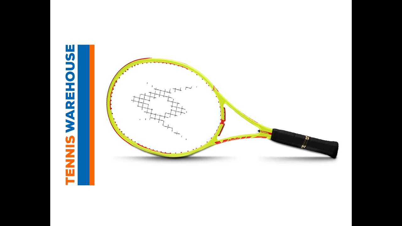
I noticed in the TW product descriptions for Wilson’s Ultra series that Wilson gives the term ‘’Uncontaminated Design’’ for the paintjob philosophy behind the Ultra, Blade and Pro Staff lines. You know, the plain, simple two-colour (or mono-colour in the RF97A’s case) cosmetics. It has been met with generally favourable reactions from those like me who always complain about ugly looking rackets and paintjobs on new rackets.
How can Wilson look us customers in the eye with a straight face and tout Uncontaminated Design as something new, exciting and salesworthy? It’s what their rackets should have looked like all along. It's not something you can say ''yeah, we've been believers and adherents of this design principle for a loooong time, since the first PS85''.
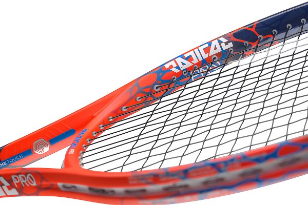
In post-Apartheid South Africa the government established the Truth and Reconciliation Commission as a way of moving on from the heinous period in that country’s strife-torn history. Wilson should establish a Racket Cosmetics Truth and Reconciliation Commission to atone for their past cosmetic design sins. A forum for all those designers who ever took a buck from Wilson to design their fugliest rackets over the past 20 years. You know what I mean: the graphic designers responsible for the King Tut-inspired red, black and gold swirly BLX range, the albino white Pro Staffs, and the general pestilence of swirly graphics and uncoordinated, asymmetrical patterns that have made Wilson one of the least successful racket companies in terms of attractive designs.
If Wilson thinks they can get away with saying Uncontaminated Design without irony and charge customers a premium for these cleaner designs then they should first put their collective hand up and offer a big mea culpa before we can give them proper credit for returning to the cleaner, attractive designs they've suddenly started offering us. No racket as stylish as the Ultra Tour will ever make up for the cosmetic catastrophes of the BLX range and I'd just like Wilson to say ''yeah sorry, we got it wrong on those, we didn't have a clue''. Maybe then I'll believe Wilson has had their Road to Damascus moment.
Rant over
How can Wilson look us customers in the eye with a straight face and tout Uncontaminated Design as something new, exciting and salesworthy? It’s what their rackets should have looked like all along. It's not something you can say ''yeah, we've been believers and adherents of this design principle for a loooong time, since the first PS85''.
In post-Apartheid South Africa the government established the Truth and Reconciliation Commission as a way of moving on from the heinous period in that country’s strife-torn history. Wilson should establish a Racket Cosmetics Truth and Reconciliation Commission to atone for their past cosmetic design sins. A forum for all those designers who ever took a buck from Wilson to design their fugliest rackets over the past 20 years. You know what I mean: the graphic designers responsible for the King Tut-inspired red, black and gold swirly BLX range, the albino white Pro Staffs, and the general pestilence of swirly graphics and uncoordinated, asymmetrical patterns that have made Wilson one of the least successful racket companies in terms of attractive designs.
If Wilson thinks they can get away with saying Uncontaminated Design without irony and charge customers a premium for these cleaner designs then they should first put their collective hand up and offer a big mea culpa before we can give them proper credit for returning to the cleaner, attractive designs they've suddenly started offering us. No racket as stylish as the Ultra Tour will ever make up for the cosmetic catastrophes of the BLX range and I'd just like Wilson to say ''yeah sorry, we got it wrong on those, we didn't have a clue''. Maybe then I'll believe Wilson has had their Road to Damascus moment.
Rant over