You are using an out of date browser. It may not display this or other websites correctly.
You should upgrade or use an alternative browser.
You should upgrade or use an alternative browser.
Outfits are getting uglier!
- Thread starter Hank
- Start date

justRick
Rookie
Nike usually has the best styles and colors.Delpo's kit the last few weeks is quite nice. The black and pink version hurt my eyes though.

slice bh compliment
G.O.A.T.
Yes.
....for me to poop on!
Kidding. Triumph the insult comic dog approves of the Juanito's shirt at RG this week. Clean simple, manly.
Kudos also to Lacoste for nicely outfitting the dubsmen and senior dubsmen. Nico mahut and Pierre hugues Herbert look great, as do messieurs Bahrami, Santoro, and Wilander.
Nike indeed has the best styles and colorsNike usually has the best styles and colors.
....for me to poop on!
Kidding. Triumph the insult comic dog approves of the Juanito's shirt at RG this week. Clean simple, manly.
Kudos also to Lacoste for nicely outfitting the dubsmen and senior dubsmen. Nico mahut and Pierre hugues Herbert look great, as do messieurs Bahrami, Santoro, and Wilander.
Last edited:
The Big Kahuna
Hall of Fame
Yes.
Nike indeed has the best styles and colors
....for me to poop on!
Kidding. Triumph the insult comic dog approves of the Juanito's shirt at RG this week. Clean simple, manly.
Kudos also to Lacoste for nicely outfitting the dubsmen and senior dubsmen. Nico mahut and Pierre hugues Herbert look great, as do messieurs Bahrami, Santoro, and Wilander.
Honestly, if you took all the logos off all the tennis apparel at TW and put them in a room and offered you anything you wanted for FREE, how many would pick something by Nike?
I doubt anyone would based on the quality, fit, material, styling, and colors.
Be honest.
Sent from my iPad using Tapatalk
The Big Kahuna
Hall of Fame
Looks just like the old Adidas stuff that Marat Safin wore when he won the Australian Open in 2005.

Sent from my iPad using Tapatalk
slice bh compliment
G.O.A.T.
Agreed.Honestly, if you took all the logos off all the tennis apparel at TW and put them in a room and offered you anything you wanted for FREE, how many would pick something by Nike?
I doubt anyone would based on the quality, fit, material, styling, and colors.
Be honest.
Sent from my iPad using Tapatalk
But...
There would be a small number who worship nike so dutifully, they would psychically sense the missing swoosh and choose accordingly. Their commitment is that deep.
NuBas
Legend
Looks just like the old Adidas stuff that Marat Safin wore when he won the Australian Open in 2005.
Sent from my iPad using Tapatalk
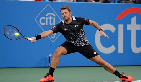
Kind of, not really. Still like the Yonex better.
slice bh compliment
G.O.A.T.
I agree. The stripes look bush league to me in white.Kind of, not really. Still like the Yonex better.
Diadora did royal and black well. Assymetrical stripe up by the shoulder. Paired with a White Rocco short with a little royal and black down the sides. Clean but colorful.
slice bh compliment
G.O.A.T.
Spot on. They think it's all cool, retro, and like eighties or nineties AF! Even tho it totes isn't.I think tennis outfits especially Nike are mostly bought by young juniors, so thats who they market towards. This to me explains the horrifying neon and bright colors the passed few years.
Nike's degigners are lazy, and clearly Heavily influenced by the female 18-24 demographic, which is horribly influenced by the tween market. Who run this mutha? Girls.
Last edited:
King No1e
G.O.A.T.
Not everything with neon is bad. Federer 's 2017 IW/Miami kit with neon yellow details was nice.I think tennis outfits especially Nike are mostly bought by young juniors, so thats who they market towards. This to me explains the horrifying neon and bright colors the passed few years.
Tennis_Hands
Banned
I think tennis outfits especially Nike are mostly bought by young juniors, so thats who they market towards. This to me explains the horrifying neon and bright colors the passed few years.
It has to do with families getting progressively poor, which leads to:
1) loss of sense of decency in style, both reflected in the choice of wear, and colours
2) loss of knowledge for quality, reflected in the choice of materials to wear
3) kids having to make do with limited clothing, which, combined with the school "demands", result in buying very few, but presumably highly "fashionable" items, which are obscenely priced for those very reasons
It is ironical, that because of limited funds people are forcing themselves into buying exorbitantly priced items.

junior74
Talk Tennis Guru
Nadal used to have cool outfits, but these last couple of seasons it looks like he's left tennis for aerobics and Zumba.
Djokovic looks good in Lacoste. Fedr's outfits are decent. Stan's sometimes very good. Murray's... well, more like hiking clothes.
I love the all white weeks we're entering
Djokovic looks good in Lacoste. Fedr's outfits are decent. Stan's sometimes very good. Murray's... well, more like hiking clothes.
I love the all white weeks we're entering
Bukowski
Professional
Not everything with neon is bad. Federer 's 2017 IW/Miami kit with neon yellow details was nice.
Agreed. There have been some nice combos, but few and far between. The all one color from head to toe like the purple of last season (?) and the highlighter yellow is just no good. I think Federer is usually dressed more conservative when compared to the rest of the line.. I believe that in the 70s/80s players wore the same design the whole year and rotated color ways? Now designers are making loads more money and change the design every freaking season, as in spring to summer.. Its gotta be very difficult to create great looking stuff when changing that frequently.. Money rules the world!
King No1e
G.O.A.T.
Nadal's all blue was not bad at all in RG, the standard Nike one was horrendous thoAgreed. There have been some nice combos, but few and far between. The all one color from head to toe like the purple of last season (?) and the highlighter yellow is just no good. I think Federer is usually dressed more conservative when compared to the rest of the line.. I believe that in the 70s/80s players wore the same design the whole year and rotated color ways? Now designers are making loads more money and change the design every freaking season, as in spring to summer.. Its gotta be very difficult to create great looking stuff when changing that frequently.. Money rules the world!
slice bh compliment
G.O.A.T.
Yup. I also laugh at how cheap the poly is on the retail versions of these shirts. No way Raf and Roger have to wear these crrapp fabrics.Nadal's all blue was not bad at all in RG, the standard Nike one was horrendous tho
tennis_balla
Hall of Fame
I hate to say it, and I never thought I'd wear something like that for tennis but I bought some H&M crewneck t-shirts and they're awesome and fraction of the price. Been through the wash countless times and no issues, look great. I've bought Nike tennis t-shirts that haven't lasted this long. They're simple, no logo etc which is perfect. I never went to H&M before, kinda had a hate for them until a friend of mine who's very well off, very good businessman shows up one day wearing one on the court. Probably my favourite shirts to coach in, fit and material and I'm on court daily for multiple hours.
slice bh compliment
G.O.A.T.
I am in. What are they made of? Poly, cotton, or a blend? Solid colors?I hate to say it, and I never thought I'd wear something like that for tennis but I bought some H&M crewneck t-shirts and they're awesome and fraction of the price. Been through the wash countless times and no issues, look great. I've bought Nike tennis t-shirts that haven't lasted this long. They're simple, no logo etc which is perfect. I never went to H&M before, kinda had a hate for them until a friend of mine who's very well off, very good businessman shows up one day wearing one on the court. Probably my favourite shirts to coach in, fit and material and I'm on court daily for multiple hours.
Last edited:
The Big Kahuna
Hall of Fame
Anyone else this Rafa looks terrible in this see-through outfit from Nike?

Sent from my iPad using Tapatalk
Sent from my iPad using Tapatalk
flanker2000fr
Hall of Fame
Outfits have been getting uglier since 1930
The Big Kahuna
Hall of Fame

Sent from my iPad using Tapatalk
justRick
Rookie
Not what I had in mind when I said I wanted to see a wet t-shirt contest.
Sent from my iPad using Tapatalk
slice bh compliment
G.O.A.T.
Lol! Looks designed for London's cooler weather. Instead, the weather this summer is more like Madrid, or Athens. So heavy sweating guys look totally drenched. Bet he feels cool in it?Not what I had in mind when I said I wanted to see a wet t-shirt contest.
Cannot imagine a hairier, sweatier guy like Pete, Rafter, or Corretja wanting that kind of material on a shirt.
I would wear those shorts with a boxer brief underneath.
The Big Kahuna
Hall of Fame
Not what I had in mind when I said I wanted to see a wet t-shirt contest.
Great if you are built like Rafa. You should see this outfit on ME!

Sent from my iPad using Tapatalk
King No1e
G.O.A.T.
Looks like a drowned rat
Sent from my iPad using Tapatalk
The Big Kahuna
Hall of Fame
Lopez,as usual, has been killing it with his kits.


I agree. Like Lacoste, Ellesse looks clean and classic and well appointed. I don’t know anyone that would look bad in this kit.
Sent from my iPad using Tapatalk
King No1e
G.O.A.T.
Yet another of the 1000 Safin/Wawrinka parallelsLooks just like the old Adidas stuff that Marat Safin wore when he won the Australian Open in 2005.
Sent from my iPad using Tapatalk
airchallenge2
Hall of Fame
Sergio Tacchini is hands down the best brand in tennis right now, as it has been forever. Fedr should have tried a deal with them
That's too funny. I love ST and own 40+ of their shirts because, to me, the brand means tennis and only tennis! However, I can't forget how bad they messed up the contract they had with Nole. It's not their fault, it's just they can't properly compete on the market nowadays.
Tennis_Hands
Banned
I agree. Like Lacoste, Ellesse looks clean and classic and well appointed. I don’t know anyone that would look bad in this kit.
Sent from my iPad using Tapatalk
Those stitches running through the middle of the sleeves would trouble me to no end.
Otherwise the design and colours of the dark shirt are very good.
Last edited:
King No1e
G.O.A.T.
Yeah it really sucked that the contract failed, Djokovic looked like an absolute badass in ST gear.That's too funny. I love ST and own 40+ of their shirts because, to me, the brand means tennis and only tennis! However, I can't forget how bad they messed up the contract they had with Nole. It's not their fault, it's just they can't properly compete on the market nowadays.
Bobby Jr
G.O.A.T.
They're not stitches, they're bonded seams (like some of Fed's shirts have had). The whole front and back panels are one piece on those shirt, with a mesh vent under each arm. Cool design and ultra thin material which I haven't seen on tennis shirts before (not that I look at every shirt that comes out).Those stitches running through the middle of the sleeves would trouble me to no end.
Otherwise the design and colours of the dark shirt are very good.
King No1e
G.O.A.T.
Poast of the centuryStandout kits at Wimbledon for me are the chair umpires and lines people. Fantastic.
slice bh compliment
G.O.A.T.
I noticed this, too. Role reversal from the early 2000s.Watching a replay of the women’s Wimbledon final. Can’t help but note the elegant simplicity of the Adidas design verses the Nike mess.
Well, with The Fortnight just about over, both huge companies will take the opportunity to show their inelegant designs all summer and fall.
Last edited:
King No1e
G.O.A.T.
Attach pics plsThis is actually a flattering picture of this crew. The red sponsor patches actually help improve it. The faux collar is brutal. Reminds me of the T-shirts that have a neck tie painted on it. And then the confetti to further exhaust the eye.....
King No1e
G.O.A.T.
Still better than the Nike AO collection, but not by muchBrutal
King No1e
G.O.A.T.
The Big Kahuna
Hall of Fame
Brutal
Not Adidas’ best work. Agreed.
Sent from my iPad using Tapatalk
AM75
Hall of Fame
Not Adidas’ best work. Agreed.
Sent from my iPad using Tapatalk
The same design works brilliantly for women though.

slice bh compliment
G.O.A.T.
Is this what "designurz" think is retro eighties cool?
Who in charge? Who run this mutha?
Thirteen year old gurlz who listen to disney radio?
Who in charge? Who run this mutha?
Thirteen year old gurlz who listen to disney radio?
The Big Kahuna
Hall of Fame
The same design works brilliantly for women though.
The Palace x adidas version for men was much better.

Sent from my iPad using Tapatalk
MugOpponent
Hall of Fame
Brutal
Other than Zverev, I think this is extremely good. I'm tempted to buy it.
Capulin Zurdo
Hall of Fame
Lopez,as usual, has been killing it with his kits.
Why won't these outfits be made available?!

Similar threads
- Replies
- 75
- Views
- 6K
M
- Replies
- 36
- Views
- 4K