Fashion Police: US Open 2017 Edition

skip1969

G.O.A.T.
Well, tourney's more than half-way through. By now we've seen just about all the kits on offer. Rain is in the forecast for this week, so at some point, we'll need something frivolous to talk about. So, lets post the good and the bad of what's on offer for our hard earned money.
 

skip1969

G.O.A.T.
I like.

r
20170831-636398143913420928_20170831221621-k28B--980x554@MundoDeportivo-Web.jpg
 

Bobby Jr

G.O.A.T.
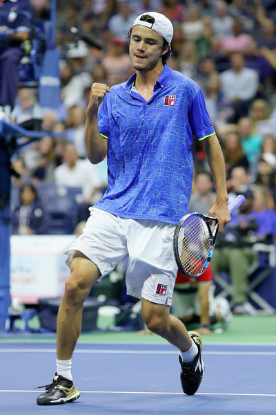
Taro Daniel's clothing was interesting. It's a Japanese brand called Roche. They do nice stuff but usually too many ideas combined into one design - a case of more is sometimes a little too much.

Taro%2BDaniel%2B2017%2BOpen%2BTennis%2BChampionships%2BE7YmwLRBsB9l.jpg
 

robbo1970

Hall of Fame
I've been disappointed with the offerings from Adidas and Nike over the last few tournaments to be honest. I know the clothing sponsorship counts towards a lot of these players' earnings, but it has to come to a point where some of them just say "I'm not wearing that". Particularly some of the Adidas abominations. Stick to the day job Pharrell.

I like the Ellesse and Fila stuff though, but my favourite at the moment (although I haven't seen any during the USO matches I have watched) is the Tacchini stuff. Old school cool.
 

abhimawa

Rookie
  • Like: all Fila (both men and women), Asics (all except CoCo Overweighe), Adidas (all)
  • Dislike: Nike (all; especially Sharapova with black outfit, makes me want to ask her for a table dance), Qiaodan sporting on Svetlana Kuznetsova (super ugly), Kapeni's outfit (looks like WWF outfit)
 
Last edited:

J011yroger

Talk Tennis Guru
Black socks on anything besides predominantly black shoes is atrocious. That goes for every Nike player this US Open including Rafa.

What happened to all these?
DG_SLP_USOPEN_DT_01.jpg

If a shoe is predominantly any color but the tongue is black, I think it looks sharp with black socks.

J
 

every7

Hall of Fame
Good Outfits:
Karolina Pliskova - The multicolour facet patterned skirt and top that she wore was eye catching and looked comfortable to play in.
Sloane Stephens - The best women's outfit of the tournament imo. A burst of colour perfectly suited to the player and the occasion.
Fed Training Outfits - The red Federer / Jordan training outfits (usually a white shirt with red shorts) have been the best men's clothes on court this year imo

Bad Outfits:
Kevin Anderson - The boring Lotto aquamarine and navy kit looked cold against the proponderance of US Open Blue around the court and partitions. Lotto took no risks with design and still managed to look awful.
Ocean Dodin - The slightly strange baggy red shirt / skirt (or was it a skort?) combo looked unusual imo. Sad to see the best dressed player on tour get given a bad kit by Nike for this US Open.
 

fed1

Professional
Halep's shoes are not new shoes, those are the Defiant Bounces she's been wearing since Miami.
 

MasterZeb

Hall of Fame
The Nike team line was horrendous this year. As was Nadals day outfit. Personally was a fan of the old school look of Adidas, but Halep was definitely a no no. Feliciano looked good as always. Querrey looked surprisingly good aswell
 

Turbo-87

G.O.A.T.
Rafa's pink jacket and hat is to much.
I agree. Years from now he will look back on that neon pink jacket and wonder what the heck he was doing wearing that. I'm all for bold splashes of color, but not that way. I did think his night gear was cool.
 

THE MAN

Professional
I agree. Years from now he will look back on that neon pink jacket and wonder what the heck he was doing wearing that. I'm all for bold splashes of color, but not that way. I did think his night gear was cool.
He may have not had a choice either. I 'am sure it was Nike's call. The night gear was cool except for way to many Nike pink swooshes showing.
 

Turbo-87

G.O.A.T.
I don't watch rafa much but I was too distracted trying to figure out his routine before serving or receiving. I think it was butt pick, shoulder, other shoulder, nose, ear, nose, other ear, forehead.
 
[QUOTE="every7, post: 11596328, member: 649007"
Kevin Anderson - The boring Lotto aquamarine and navy kit looked cold against the proponderance of US Open Blue around the court and partitions. Lotto took no risks with design and still managed to look awful.
[/QUOTE]

Not a bad outfit, but it seemed more appropriate for the Tour Finals. Bespoke, but not fitting of the USO.
 
[QUOTE="every7, post: 11596328, member: 649007"
Kevin Anderson - The boring Lotto aquamarine and navy kit looked cold against the proponderance of US Open Blue around the court and partitions. Lotto took no risks with design and still managed to look awful.
Not a bad outfit, but it seemed more appropriate for the Tour Finals. Bespoke, but not fitting of the USO.[/QUOTE]

Final itself was boring, cold and not fitting of the USO in most ways; Fed would have looked great out there - if his back let him get that far - but that's want you get when you try to manipulate the draw...#querryisnerconspiracytheory
 
Top