Cosmetic preferences

magnut

Hall of Fame
i say why stop with paint. racquets have been the same basic idea for ages. spice it up.

i want a see through or clear racquet. Something like glass or polycarb. i dont know how they could do it but it would be pretty sweet. have like a scorpion molded into the throat or something.

glow in the dark racquets and balls would be really cool. you could play in pretty low light conditions.

a racquet with small LEDs around the head would be pretty sweet as well. might look like a UFO but neat. i wonder if the lights would trail with faster swings.

The best would be a frame that makes different sounds on contact.
 

WhereIsMacMac

Professional
You mean like this? :)


0,,12781~9445466,00.jpg


BP, what is that racquet he's using? Or is the image altered
 

Alex78

Hall of Fame
^^ photoshopped, looks like a TGK233.1 / MG Radical Pro to me. - Or maybe it's an Instinct? Not totally sure.
But man, the green does look sweet on that racket!
 

Alex78

Hall of Fame
Image is not altered. That's the racquet that Peng Shuai used a couple of years ago. I heard it's an Asia-only Head frame, so I don't know what model it is.

Wow, never knew Head used green colors on a (tour series) racket since the late 90ies...
 

BreakPoint

Bionic Poster
^^ photoshopped, looks like a TGK233.1 / MG Radical Pro to me. - Or maybe it's an Instinct? Not totally sure.
But man, the green does look sweet on that racket!
Not photoshopped. You can search and find tons of pics of Peng Shuai using that green Head racquet.

Also, look here:

http://tt.tennis-warehouse.com/showthread.php?t=364606

http://tt.tennis-warehouse.com/showthread.php?t=324612

http://tt.tennis-warehouse.com/showthread.php?t=269820

http://tt.tennis-warehouse.com/showthread.php?t=346454

http://tt.tennis-warehouse.com/showthread.php?t=375809
 

Alex78

Hall of Fame
Fantastic! Truly a great-looking racket :)
Wish Head would start using that metallic green again. I'd personally love a flexier Prestige MP in that green color, similar to what the old Elite Pro of the late 80ies was to the then current Prestige Pro.
 
Im a design fiend and make a living evaluating visual things.

I prefer simple often monochromatic designs and wish there was more green out there. The old Fischer's were awesome but theall time kings were the Donnay Flex Pro
flex_fiber_pros1.jpg


I also loved the Max 200G
 

robbo1970

Hall of Fame
ooooohhh boy did we have some conflict concerning the pronounciation of that word in chemistry class back in school :)

No, I'm English, we pronounce it 'aloo-mini-um', because that's how it is spelled lol, and the word you mean't to say is 'pronunciation'. :)

I just like pulling people's legs, but I love you all really....well, most of you. :)
 

WhereIsMacMac

Professional
Why not offer different paintjobs for each racquet (paintjob, not just the accents) like what Dunlop is doing with its iDapt?
 

BreakPoint

Bionic Poster
Yeah, Donnay had by far the best paintjobs of any wood racquets. Actually, they were some sort of plasticized coating over the wood.
 

robbo1970

Hall of Fame
Yeah, Donnay had by far the best paintjobs of any wood racquets. Actually, they were some sort of plasticized coating over the wood.

Yeah they did a good job with their pj's. The paint was very thick, almost like a powder coating job.

I liked the Snauwert Gerulitis pj's as well. In fact, it's difficult to knock many of the pj's on old woodies. Adidas did some smart pj's too.
 

SpinToWin

Talk Tennis Guru
No, I'm English, we pronounce it 'aloo-mini-um', because that's how it is spelled lol, and the word you mean't to say is 'pronunciation'. :)

I just like pulling people's legs, but I love you all really....well, most of you. :)

ahahah well aren't we all a wonderful family around here :p I was in an international school with people from various parts of the world, so conflict on such matters was pre-determined. Usually, it was a case of australians, british and americans fighting about how to pronounce the word and the non native speakers watching in utter confusion, it was great :lol:
 

Fuji

Legend
No, I'm English, we pronounce it 'aloo-mini-um', because that's how it is spelled lol, and the word you mean't to say is 'pronunciation'. :)

I just like pulling people's legs, but I love you all really....well, most of you. :)

I had an English chemistry prof a couple years back, and here in Canada (at least my province) most people say "al-oo-min-um." It drove him up the wall hearing us speak hahaha!

-Fuji
 

burn1986

Banned
Matte Black with bold white letters and Flourescent colors (Strike), expecially flour yellow, orange, pink, and green. These go excellent with flat black.

I like the Strike PJ, and the Wilson Ultra II mid (although the colors needed to be brighter). The Pro Staff 85 looks too friendly and boring.

I do not like white or solid color racquets, like the radicals, or whatever Bagdatis (sp?) uses.
 

BreakPoint

Bionic Poster
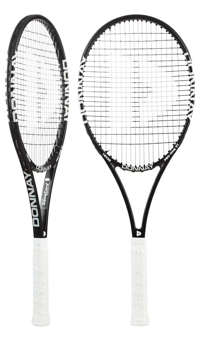
I find the paintjob of the current Donnay Pro One 97 to be very nice. Just black with bold font lettering in a contrasting color. Here it's in white, but it could also be another color that stands out.


rs.php
 
Last edited:

Racketdesign

Semi-Pro
Really interesting to hear everyone's views and comments. I guess the next question has to be what's the least favourite colour of racket on the market today?
 

WhereIsMacMac

Professional
Really interesting to hear everyone's views and comments. I guess the next question has to be what's the least favourite colour of racket on the market today?

People on this boards don't seem to like *too much* holographic stuff on their racquets

rs.php


Have you seen the new Instincts? I don't think they like them too
 

WhereIsMacMac

Professional
People seem to like specific colors associated to a racquet line, like red for the Prestige, orange for the Radical... blue for the Pure Drive, yellow for the Aero Pro Drive
 

Fuji

Legend
Really interesting to hear everyone's views and comments. I guess the next question has to be what's the least favourite colour of racket on the market today?

I'm personally not a big fan of white. The prostaffs were okay, but just too much white. A little is fine, but having so much was a little off putting.

-Fuji
 

SpinToWin

Talk Tennis Guru
Really interesting to hear everyone's views and comments. I guess the next question has to be what's the least favourite colour of racket on the market today?

White for sure. White is nice as a detail on a racquet or in order to make a contrast to the other colors, but a whole racquet in white looks horrendous.
 

SFrazeur

Legend
I prefer symmetric cosmetics and the color blue. What attracts me to a racquet if I am in the market is the head shape. I'm over midsize racquets at this point and want a nice wide head in a roundish or upside-down tear drop shape.
 

thatguymattin

Semi-Pro
Wilson N90, BLXTour, PSBLX, K88, and PS85 have the best paint jobs I. My opinion. Some donnay racquets are nice. Also The blade lineup is nice, but there's too much black that it lacks character. I don't like anything that looks as if it were a drift car or rally car, I.e. Babolats.
 

BreakPoint

Bionic Poster
Really interesting to hear everyone's views and comments. I guess the next question has to be what's the least favourite colour of racket on the market today?
I'm not too keen on pink colored racquets. ;)

Also, too many red, white, yellow, and orange racquets. I think we need more green and blue racquets.
 

kingcheetah

Hall of Fame
I'm not too keen on pink colored racquets. ;)

Also, too many red, white, yellow, and orange racquets. I think we need more green and blue racquets.

I agree about the overused colors. If you are using a "players" frame, it is almost always going to be red, black, or orange. I'd like to see somebody come out with a green racquet (not dark green like the old Wilson Surge, nor lime green as that would be an eyesore... a decent shade in the middle)
 
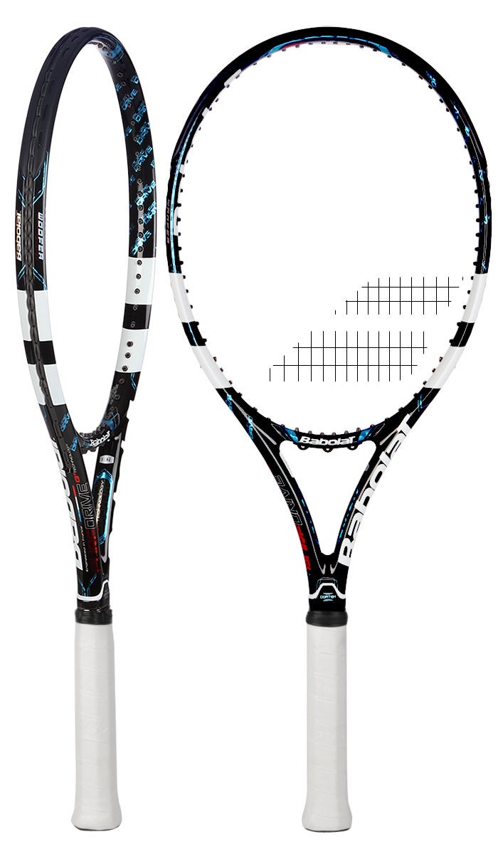
I really liked the blue on the previous generation Pure Drive. The fact that it was an excellent racquet was an added bonus.

The Pure Strike looks aggressive and bold. I love it. The kind of minimalist design on the Mega Age frames were also appealing to my eyes.

I would like to see more purple in racquets though... That or just some clear coat over graphite.
 

mhkeuns

Hall of Fame
Just picked up a Donnay X-Red Plus 94. What a nice looking frame with red and black chrome? paint. Seems like the Babolat Pure Strike, Head Graphene Prestige and the RF 97 took notes from the Donnay X-Red series.
 

flyen

New User
I'm using the Wilson Pro Staff 95 2014..
not the best paint job to look at..

but...on a hot hot day the white paint still feels cool to the touch..where as a dark paint job absorbs the heat of the hot sun and feels hot to the touch..theory???
 

SpinToWin

Talk Tennis Guru
I'm using the Wilson Pro Staff 95 2014..
not the best paint job to look at..

but...on a hot hot day the white paint still feels cool to the touch..where as a dark paint job absorbs the heat of the hot sun and feels hot to the touch..theory???

What do you mean theory? Black is a color that absorbs heat more than any other. In physics, an absolute black object is said to release the least heat when a certain amount of heat is radiated upon it. In other words, black absorbs the most heat of any color. Since white is the polar opposite of black, the opposite is true for it (it absorbs the least heat). This is no theory, but a commonly known physical phenomenon.
 
Last edited:

BreakPoint

Bionic Poster
What do you mean theory? Black is a color that absorbs heat more than any other. In physics, an absolute black object is said to release the least heat when a certain amount of heat is radiated upon it. In other words, black absorbs the most heat of any color. Since white is the polar opposite of black, the opposite is true for it (it absorbs the least heat). This is no theory, but a commonly known physical phenomenon.
However, contrary to popular belief, black clothes actually keep you cooler in the sun than white clothes do.

http://io9.com/5903956/the-physics-that-explain-why-you-should-wear-black-this-summer
 

HRB

Hall of Fame
I would be happy with just plain black matte or otherwise. I would be fine with a raw frame with no paint whatsoever on it as well. I think racquets are the ugliest they have ever been. Most look like they should be some sort of NASCAR commemorative. Funny how you dont see people buying cars that have nascar paint jobs. Most of the time its a solid color with maybe a little pinstriping.

I have no idea why racquet companies started making frames so ugly. agassi effect maybe? Racquets used to look like elegant tools....now they look like cheap toys.

I stripped down a HPS 6.1 that still had plenty of life in it but tons of scratches and chips. By the time I was done sanding off the old paint I loved the look of the "naked frame"...kinda looks like it is made of marble or carved granite!

People rave about how cool my "Naked Pro Staff" looks....if you got a favorite stick, that has gotten pretty beat up and ugly, strip it down!
 

ultradr

Legend
I liked Head Flexpoint Prestige. Generally all Prestige including new ones. Probably because the wrap-around cap grommet.
Flexpoint design around midhoop. I just loved it.

I also liked Kfactor 6.1 tour. Somewhat unusual at the time but loved it. Also love simple design of KPS88 and Donnay Pro one.

Generally uncomfortable with certain colors like yellow.
 

Don't Let It Bounce

Hall of Fame
With quite a broad mix of design styles on the latest models released by some brands, is there a specific part of a racket cosmetic that attracts us? Paint colour? Type of finish? Asymmetric or symmetric layout?
I like the monochromatic matte finishes that many of the other posters like, but presumably you already know from the Vantage designs how much that helps sales.

Same for the chrome finishes: the Donnay X series were some of the sharpest-looking frames of recent years, but you are doing something very similar with the Angell frames and are probably looking for a new idea.

Very detailed paint jobs seem to need more than a simple like/don't like. Some work for me (some of the Wilson K-Factors, most of the Dunlop Biomimetics, and the Prince 'Jackson Pollock' EXO3's) and some don't (Head Microgel, Wilson Steam & Juice, and – sorry! – BastCore). These designs would be a risk for a smaller company, I guess, but some risks pay off.

If I were in your situation, depending on how the following affect costs, I might look at:
  • Something between monochromatic and 'busy': large swatches of color, like Agassi's first Donnays, recent Tecnifibres, or the 1990s Heads that faded between black and a color. (Speaking of which, gradients have always been very appealing to me.) I'd consider asymmetric designs just to keep from limiting the possibilities.
  • A monochromatic, or close to it, design with an interesting texture or visual effect (the Angell chrome goes in this category): sandpaperish like the Yamaha Secret, a sparkle effect like the beloved old Prestige paint jobs, or (I would love this) a pearlized finish like the old Bard 'Chinese lacquer' finishes.
  • I'm a big fan of understated corporate identifiers on frames; the most recent Kneissl ones are a beautiful example. More to the point, going subtle is a way of visually distinguishing your frames from most of the mass-produced ones.
  • Talking to a pro designer who can come up with stuff the rest of us can't, like the designs Fischer got from Nicole Dürr. More than two decades later, those frames still make people go, "Wow."
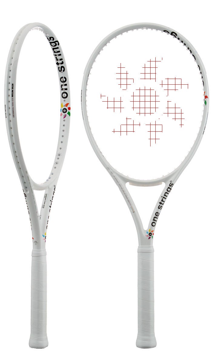
Disclaimer: I really like white frames, so I may be out of touch with the racket cosmetic zeitgeist...
 
Last edited:
Top